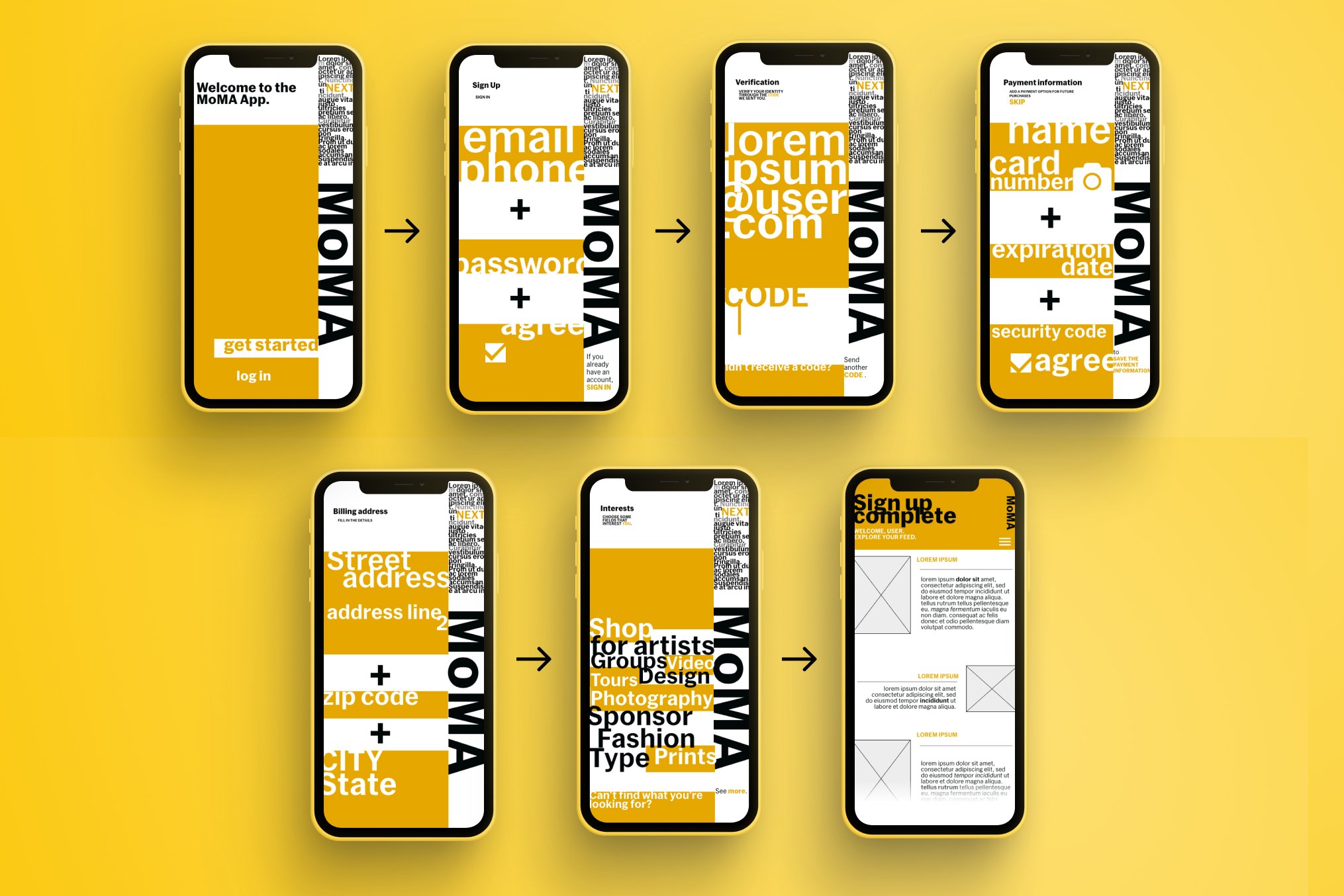
MOMA SIGN-UP FLOW
A sign-up flow inspired by a fictional app for the Museum of Modern Art.
Style guide
My analysis of the MoMA design system
Inspired by: https://www.pentagram.com/work/moma#16900
The first step in my design process was analyzing the brand identity of MoMA. Unlike many brand identity guidelines–which use a color palette as their differentiating factor–MoMA relies on a design system instead. The recognizable element is the design layout, a combination between a visual asset and their characteristic typeface. I re-created Pentagram’s design system, and tried to break it down for a better understanding of its components.
Mood Board
Final SIGN-UP FLOW
This is an overview of all the steps I included in the sign-up flow.
I used a main color, while turning the information input fields into the visual asset, much like a MoMA print materials.
WIRERFRAMES
Learnings
The goal was to analyse the brand’s style guide and create a sign-up flow that would reflect their identity.
To be able to achieve that, I had to analyse their brand style, encompassing typography, color scheme, and layout guidelines and apply these to a fictional sign-up flow.


